Tuesday, May 12, 2009

Final Assignment - Personal Logo


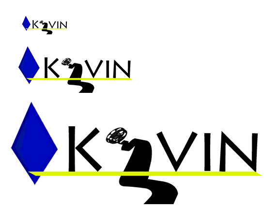
For this design I wanted something simple and neat while still being vibrant and noticeable. I initially started by writing out my name and seeing different methods of formatting it. I then considered how I would use this sort of logo and implement elements that were fitting to that particular category. The most prominent thing I could think of was film so I tried implementing different types of images revolving around that into the text. It is then when I thought of replacing the ‘e’ in my name with the film roll. After creating the film roll I switched between several different fonts until I decided on Lithos Pro as it is incredibly clean and seemed to give the word a nice overall flow.

Next I underlined the text with a black line and cut the two ends in opposite directions to give it a more dynamic feel. After this I wanted something that would catch the eye even if the logo itself was printed small. I tried several different shapes including parallel horizontal lines in the background and a sort of mountain styled outline after finally deciding upon the blue diamond. After I had placed it near the ‘K’ I decided to change the underlines color to yellow to compliment the diamond better. Finally, at the suggestion of my teacher I expanded the film roll to go beyond the underline.


Monday, May 11, 2009

Third Assignment - Typography Portrait

Our third assignment was to create a self portrait while implementing 5 aspects of ourself through text and imagery. The five aspect I chose were Quite, Pessimistic, Thinks Ahead, Science-Fiction and Humorous.


I started by taking a number of pictues of myself and designed how I could incorporate each aspect into ach picture. After choosing one I silhouetted it and proceded to place each aspect.


Quite was placed in my hair with a simmilair font color to make it difficult to see.

Pessimistic was inniitially placed near the transparent portion of the neck.

Thinks Ahead was represented by a thought bubble with a Lightbulb in it.

Science-Fiction was initiallly represented by a little UFO but I opted to change it to a Police Public Call Box, the signature TARDIS of the television series "Doctor Who", an almost 50 year old Science Fiction franchise because I felt it represented it better. It also give it a bit more of a curious look.

Humour was supposed to be represnted by the outline of a lauging face simmilair to those you would see on theatre masks. But no matter how many variations I used it always end up looking more scary then humuor. Ultimatley I opted for a more cartoony smile.


Second Assignment - Fonts

Our second assignment was to produce five fonts based on the following words: Osmosis, Hotdog, Cowboy, Linear and our own name.


This is my Osmosis font. I wanted the text to demonstrate the process of Osmosis using the font and achieved this by wraping the text in to cells and then warping it. Ultimatley I am happy with the results.


This is my Hotdog font. I'm not particularly proud of it but I was lost for ideas.


My Linear font. I wanted to to make this font but go beyond just having straight lines. I ultimatley came up witht he idea of a linear path which formed the text.


My Cowboy text. Terrible.


My name text. Took me a long time to figure out what I should do for this one. The K as the rewind button was the first thing that came to mind followed by the glasses on the "I". Finnaly swithching the "e" with the Pacman. I wanted a smooth font with a cool color so I choose these.

Friday, May 8, 2009

First Assignment - Textbook Cover Redesign

Our first assignment was to redesign the cover of out Textbook, "Graphic Design Basics" by Amy E. Arnston.


After almost 20 thumbnails I came up with this stairway design. I like it's simplicity and its symbolism behind the process of design.


Initial outlining in Photoshop.


Colored variations of text and placement. Ultimately the stairs ended up aligned all the way to the right.


Final Version.